Landing Page
Process
Animation
year
2024


Disneyland Character Meet & Greet Landing Page – A Fun & Interactive Experience
This project is all about bringing Disney magic online through a fun and engaging landing page. The goal was simple—help visitors quickly check when and where their favorite characters will be available for a meet-and-greet at Disneyland.
Instead of a boring, text-heavy schedule, I designed an interactive and visually exciting experience, making each character’s page feel special. To make things even more fun, I added smooth animations so that the page feels alive, just like Disneyland itself!

Why This Project?
When I started, I thought about how visitors usually find character meet-and-greet details. The common way? Scrolling through long schedules or using complicated park apps. That’s not fun, especially for kids and families who just want a quick look at their favorite character’s availability.
So, I set out to solve this by:
Making the information clear & easy to find
Bringing in character-themed designs so every page feels like part of their world
Adding animations to create a playful, immersive experience
Understanding the Users
I put myself in the shoes of a typical Disneyland visitor—excited kids, busy parents, and Disney fans who don’t want to miss a chance to meet their favorite characters.
After gathering insights, here’s what I found:
People prefer visuals over text-heavy schedules – A well-designed character page makes finding details much easier.
Fast access is a must – No one wants to click through multiple menus just to find out when Mickey is available.
A little animation makes things magical – Subtle movements and interactive elements keep users engaged.
Design Approach
Keeping It Simple & Fun
I started with clean and structured wireframes, ensuring that the most important details—character name, image, timing, and location—were front and center.
Each character has their own dedicated page, and I designed it to feel like stepping into their world.
Creating a Character-Themed Experience
To create a visually immersive experience, I designed each character’s landing page with a background color that reflects their personality and story:
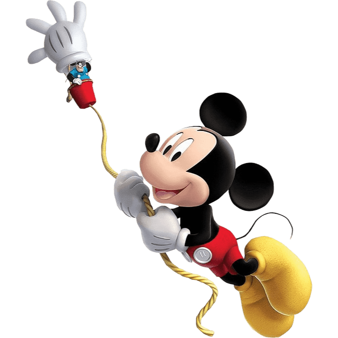
Mickey Mouse – Red Background: The background for Mickey’s page is a vibrant red, inspired by his iconic red shorts and classic Disney charm. This color choice brings a sense of nostalgia, fun, and excitement, just like Mickey himself.
Elsa – Blue Background: Elsa’s page features a cool blue background, representing her icy powers, elegant demeanor, and the wintry world of Arendelle. Blue evokes a feeling of calmness and magic, mirroring her character’s journey.
Flynn Rider – Brown Background: Flynn’s page has a warm brown background, reflecting his adventurous and mischievous personality. The earthy tone ties into his rugged charm and his journey from a rogue thief to a true hero.
Joy – Green Background: Joy’s page bursts with a bright green background, symbolizing her boundless energy, optimism, and positivity. Green represents growth and happiness, making it the perfect choice for her uplifting character.
These background colors were carefully chosen to instantly transport users into the world of each character, making the experience more engaging and memorable.
Making It Interactive & Engaging
To make the experience truly Disney-like, I added small but impactful animations:
Character Rotation Animation – When users switch between characters, their images rotate slightly before settling into place, making it feel lively.
Subtle Background Movement – Floating snowflakes, twinkling sparkles, or glowing lanterns, depending on the character.

Challenges & How I Solved Them
Balancing Aesthetics with Readability – Some backgrounds were so colorful that text wasn’t standing out. I fixed this by adding soft overlays and making text bold & high-contrast.
Keeping Animations Smooth, Not Distracting – I didn’t want too many moving elements overwhelming the screen. The solution? Controlled animation speeds and limiting the number of things moving at once.
Making Each Page Unique But Consistent – Every character had their own theme, but the structure had to feel the same. I kept fonts, button placements, and layouts consistent while only changing colors, backgrounds, and animations.


The Final Experience
The end result was a fun, engaging, and super easy-to-use landing page that:
Provides quick access to meet-and-greet schedules, ensuring visitors can easily find character timings and locations.
Feels visually immersive & character-specific, with backgrounds and themes that match each character’s unique personality.
Brings the magic to life through smooth animations, making the experience playful and interactive.
What I Learned
Small design details make a big impact – Just changing colors, fonts, and adding tiny animations made each page feel unique.
Simplicity is key – The best designs are the ones that don’t overwhelm users but instead guide them effortlessly.
Playful UI keeps users engaged – Animations and themed elements made the page much more fun to explore.